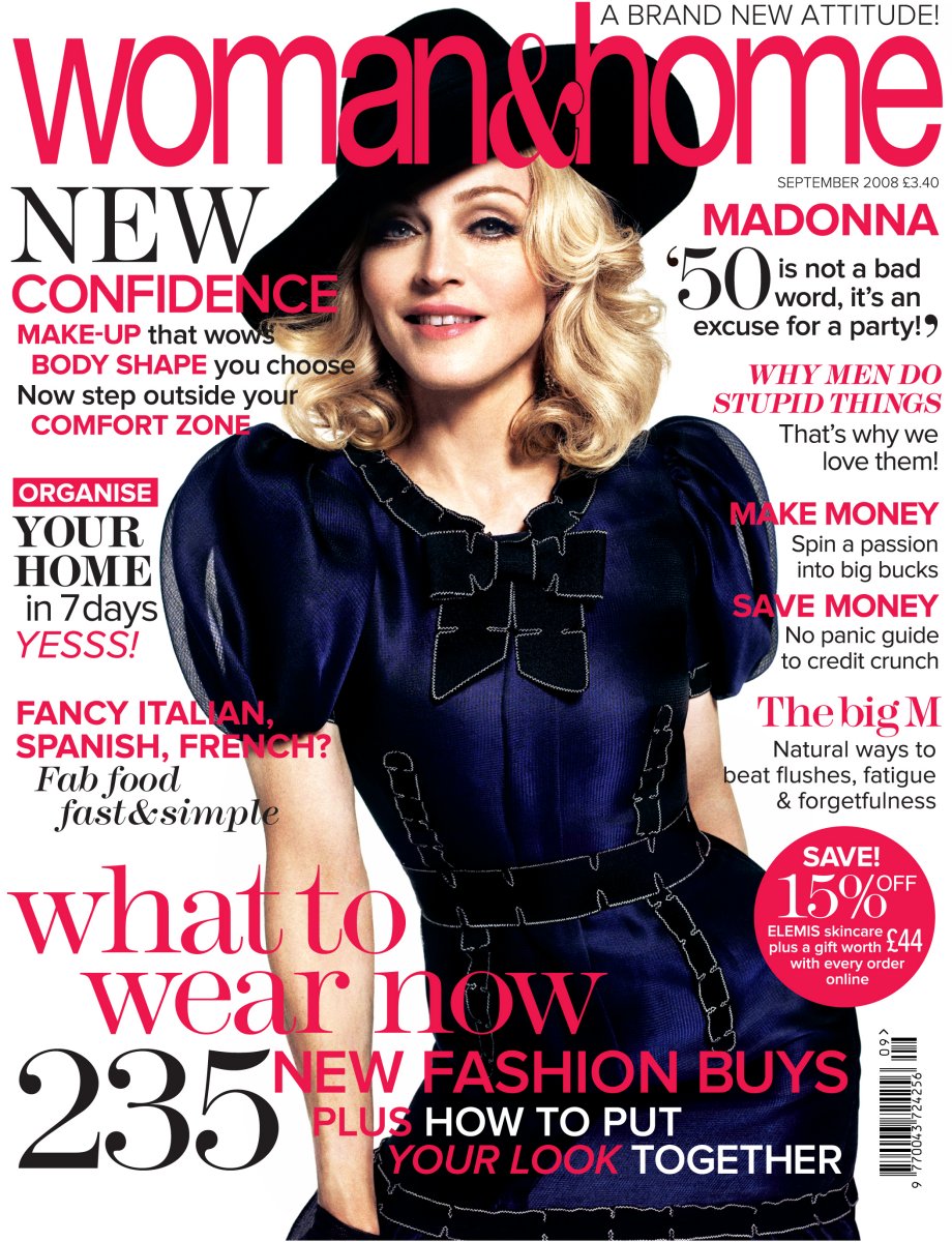
The magazine is clearly for older women as the model on each cover is an older women. The content inside has information and help with fashion, hair and beauty, easy quick recipes, diet and health etc.
This particular cover looks quite busy and therefore gives off the impression that there is a lot of good information inside.
The masthead is very girly with an older style of writing that goes along with the attitude and age group of the magazine, the bold pink that it is in gives it this girly twist and makes it stand out of the page. The masthead is the first thing that i look at because of the font, but mainly because of the colour of writing.
The model looks happy and is wearing quite old fashioned styled clothes with a twist of modern. The dark blue contrasts with the three colour colour scheme as it consists of white, black and pink. The dark blue of the white background makes the model pop out the page. I think there is too much pink used throughout the page as it feels like they are forcing the fact that the magazine is a women's magazine. Instead they could of used more black for the sell lines.
The sell lines are very overpowering as there is a lot of information in each one and every sell line overlaps the model and consequently send the focus of the model to the back. I think that by placing the sell lines like this on the page it makes it look very overwhelming. I don't like the sell line at the bottom of the page at all, it is far too big and takes over the whole magazine cover. The way it is laid out on the page with each line of the writing lined more to the right of the page each time it looks a messy and it looks like they are trying to take up as much free space as they can. With the big masthead at the top of the page and the big sell line at the bottom the space is very limited. I think there should be less sell lines and a bit more space.
I like the use of different styles of fonts throughout the magazine as it makes the page look more interesting, each font links in with the attitude of the magazine as they look elegant and stylish.
No comments:
Post a Comment