Tuesday, 26 March 2013

First Draft of DPS


This is the first draft of my DPS, it is the sort of layout I am thinking about for my actual piece. I didnt want to carry on the colour scheme from the draft of my front cover as I didnt like the colours from it being that bright, therefore i tried a different colour scheme. However, had i liked the colour scheme from the front cover then i would of carried it on. I am planning on using the same colour scheme in my actual DPS, front cover and contents page as it makes it look more professional and links every page in with each other.

I saw the photo of Lana Del Rey and thought instantly about putting the articles around the image, I really like the layout and think it looks really effective. I think from editing the image, the bursting red from the chair and ribbons round her wrists draws attention to the page. This is when I created the three colour, colour scheme and therefore went with red, white and black.

I plan on doing something like this for my actual DPS because I like it a lot, I want a bursting colour contrasting with black and white and a lanscape image so I can put it across both pages.

Tuesday, 19 March 2013

First draft


This is my first draft of my magazine cover. I am going to use a mid shot or a close of the model because i like the way the masthead goes over the head of the model. 

I am still under sided of what my magazine will be called, this is why i have just put 'Masthead' at in the place of the masthead.  

I love the photo the edit I have done, however when it came to adding the sell lines etc. and creating the three colour, colour scheme i found it hard because I couldn't find a good set of colours, a part from bright colours, that would stand out on the background so you were able to read it. This is the main thing I don't like; the three colour, colour scheme because personally I don't like vibrant colours therefore I would change this in the next draft.

Wednesday, 13 March 2013

Photo edits

Here are a few photo edits that we did in one of our lessons. The photo edits are of Biffy Clyro and Lana Del Rey. 

This is the original photo that we took from Google. 
First Edit- black and white with coloured background
 Final Edit with light effect
 Original image from google
First Edit- black and white with coloured flag
 Final edit with flames
Final edit with stars

Tuesday, 5 March 2013

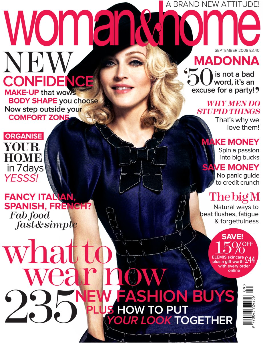
Women & Home deconstruction

According to www.pressgazette.co.uk 'Women & Home' magazine sold 347,653 copies in the first half of 2012. The sales have gone down by 1.5%. I think this is mostly down to the recession as the magazine aims at older women and most women at the moment would rather put the money they spend on the magazine on other things such as; bills, food, clothes for their children etc. 

The magazine is clearly for older women as  the model on each cover is an older women. The content inside has information and help with fashion, hair and beauty, easy quick recipes, diet and health etc. 

This particular cover looks quite busy and therefore gives off the impression that there is a lot of good information inside. 

The masthead is very girly with an older style of writing that goes along with the attitude and age group of the magazine, the bold pink that it is in gives it this girly twist and makes it stand out of the page. The masthead is the first thing that i look at because of the font, but mainly because of the colour of writing. 

The model looks happy and is wearing quite old fashioned styled clothes with a twist of modern. The dark blue contrasts with the three colour colour scheme as it consists of white, black and pink. The dark blue of the white background makes the model pop out the page. I think there is too much pink used throughout the page as it feels like they are forcing the fact that the magazine is a women's magazine. Instead they could of used more black for the sell lines.

The sell lines are very overpowering as there is a lot of information in each one and every sell line overlaps the model and consequently send the focus of the model to the back. I think that by placing the sell lines like this on the page it makes it look very overwhelming. I don't like the sell line at the bottom of the page at all, it is far too big and takes over the whole magazine cover. The way it is laid out on the page with each line of the writing lined more to the right of the page each time it looks a messy and it looks like they are trying to take up as much free space as they can. With the big masthead at the top of the page and the big sell line at the bottom the space is very limited. I think there should be less sell lines and a bit more space. 

I like the use of different styles of fonts throughout the magazine as it makes the page look more interesting, each font links in with the attitude of the magazine as they look elegant and stylish. 

Monday, 4 March 2013

UGT and HNE


In the lesson  today we talked about the Uses and Gratifications Theory (UGT)  and the  Hypodermic Needle (HNT). We have previously researched about these theories individually for homework. Below is the infomation that i found.

Uses and Gratifications Theory
This theory is based on how people use media for their need and gratification. In other words we can say this theory states what people do with media rather than what media does to people. Gratifications can be obtained from a medium's content and from the social context it used . For example watching a specific programme, and watching TV with their family. Studies suggest that peoples needs and moods influence how they use and respond to a medium, for example, feeling bored results in them wanting to watch exciting content and feeling stressed encourages relaxing content.

Hypodermic Needle Theory
The theory suggests that the mass media could influence a very large group of people directly and uniformly by ‘shooting’ or ‘injecting’ them with appropriate messages designed to trigger a desired response. Both images used to express this theory (a bullet and a needle) suggest a powerful and direct flow of information from the sender to the receiver.
In todays lesson i learnt more about this theory, we recited from SpiderMan that says "with great power comes great responsibility" this was applied to the mass media as they are so powerful they can 'inject' whatever messages they want to into their audience.
We were shown The Sun's frount page of Arthur Scargill caught in the motion of a wave which unfortunetly looked as if he was standing in the 'Hitler Stance' with the masthead of 'Mine Fuhrer'. The print unions decided that the photo was too insulting and decided not to print it, therefore resulting in there being no photo on the front page with no masthead. Consiquently proving that the print unions were more powerful than the owner, Rupert Murdoch, as they went against his wishes of keeping it. Below is what the front page would of looked like and then what was printed.