Wednesday, 27 February 2013

Textual analysis of Vibe and Q


Vibe magazine

The first thing that captures my eye is the image, it is a close up of Kanye West and his pose is quite arrogant and therefore in a way captures your attention. His head is overlaps the masthead which could indercate that he is more important than the magazine.

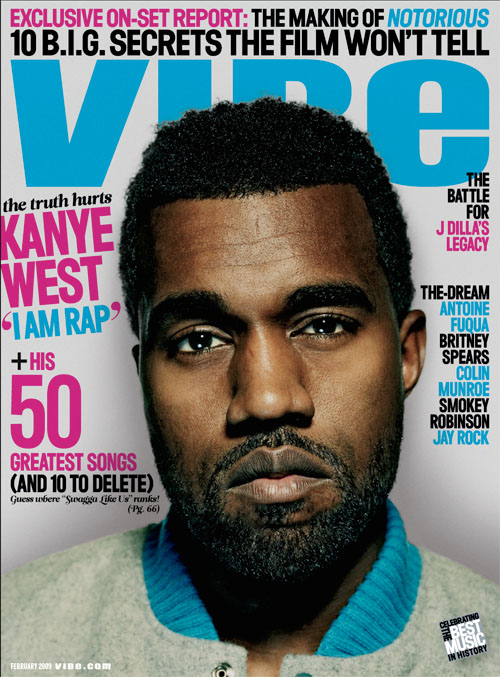
I'd say the next thing that captures my attention is the headline next to the image that reads "the truth hurts Kanye West 'I am rap'". The words Kayne West and 'I am rap' draw me to read it as they are in a bigger font, bold and a different colour to the other sell lines. I like the way this headline is on a tilt, almost to match the image as Kayne's head is also on a tilt therefore they have made good use of that space. However, the space below the sell lines above the barcode and the bottom little corner there is a big amount of free space, it makes the page look quite boring. The designer's could of put more sell lines, social networking logos and information or a burst within that space to make it look like more is going on and therefore intise the reader in.

The masthead is across the top of the page in bold writing and in a different font to the other writing on the page. It stands out as it is in a vibrent colour. I like the title of the magazine as it could represent how this genre of the magazine makes the people feel when listening to this type of music.

There is a three colour colour scheme of pink, blue and black. This makes the magazine look more professtional and they are all eye catching, bold colours.

The sell lines to the right of the page are short and snappy. They are names of artist's which could mean what the reader would see within the magazine. Personally i dont like these sell lines as they dont say much about what is inside. The top right sell line looks out of place as it overlaps the masthead. To make better use of the free space below they designer's should have moved the sell lines down, however the other sell line with the artist's names look good and creative as they fit around Kayne's ear.


Q magazine


The first thing that i see is the bold red masthead at the top right corner of the page. It over laps the models head slightly suggesting that it is more important and dominates the page for attention.

The coverline 'The UK's biggest music magazine' stands out because it is in white on black in capital letters. The coverline is quite persuasive, it captures the reader's eye and draws them in wanting to read and buy the magazine.

The model looks quite dark and appealing to the eye and therefore might make reader's buy it. The mise en scene in the cover photo, such as her dark make up and black leather looking clothing is in tied with theme of the rock styled magazine. Along with this by using the words 'Cheryl Cole rocks' with the word rocks in bright red ties in with this theme and portrays the model as a rock chick. Underneath the model the magazine uses the model's song '3 words' to sell the story within the magazine.

Throughout the cover there is a three colour colour scheme of red, black and white. It makes the magazine look more professional and by using the bold colours it creates an eye catching cover.

The sell lines overlap the model slightly with the writing in white, red and gray. As you read down the sell lines they get smaller and consiquently arent as bold as the top of the sell lines. I find the smaller writing hard to read especially on the background that it is on i.e. the rain drops have a light sheen to them making the gray writing in particular difficult to read.

Wednesday, 20 February 2013

History of music magazine Vibe and Q

 
Vibe is a music and entertainment magazine founded by producer Quincy Jones. The publication predominantly features R&B and hip-hop music artists, actors and other entertainers. Quincy Jones launched Vibe in 1993, in partnership with Time Inc. Originally, the publication had been called Volume before co-founding editor, Scott Poulson-Bryant gave it the name Vibe.
 
After shutting down production in Summer 2009, Vibe was purchased by the private equity investment fund InterMedia Partners and is now issued every-other month.


Q has a mix of different genre's of music within the magazine. The cover models vary from Lady Gaga to Michael Jackson.The first issue was produced in October 1986 from then on the magazine publishs another issue every month. The circulation and readership in January - December 2003 was 800,000 and 950,000 and has dropped to 64,000 and 470,000 in January - December 2011.
 
Every issue of Q has a different message on the spine. Readers then try to work out what the message has to do with the content of the magazine. The magazine is well known for compiling lists. It has created many, ranging from "The 100 Greatest albums" to the "100 Greatest '100 Greatest' Lists".
 

Tuesday, 19 February 2013

Research Methods

In my lessons i have learnt about different research methods to use.
There are four different methods:
  • Primary
  • Secondary
  • Quantitative
  • Qualitative
 
Primary is research you find and carry out yourself. It involves using questionnaire's/survey's, interviews, foucus groups, word and mouth, letter's, email, textual analysis etc.
Adavntages:
  • You can research exactly what you want, how you want, and don't have to rely on other peoples work.
  • You can interpret the results how you want, and dont need to rely on other peoples interpretations.
  • The research will be accurate for the current time / place / situation you are studying.
  • It is tailored exactly to your needs.
Disadvantages:
  • It can take a lot of time and cost a lot of money to conduct primary research
  • You might not always have the necessary things to conduct it, e.g. samples etc.
Secondary research is research you take and use from someone else. This means that you would use books, internet, search engine's, industry websites, blogs, newspapers and magazine's.
Advantages:
  • It is often cheaper than doing primary research.
  • It may allow you access to data you could not otherwise get.
Disadvantages:
  • You may have less control over how the data was collected.
  • There may be biases in the data that you don't know about.
  • Its answers may not exactly fit your research questions.
  • It may be obsolete data.
Quantitative research is to do with numbers and looking for patterns and trends. The methods you would use questionnaires, survey's etc.
Advantages:
  • Quantitive data is in great quantity
  • Cheap to manufacture
  • Easier to answer
Disadvantages:
  • The context of the study or experiment is ignored
  • It not study things in a natural setting or discuss the meaning things have for different people
Qualitative research is finding out people's opinions and responces in a structerd way. You can use
Disadvantages:
  •  The questions by researchers can lead to the people being asked to be interviewers desirability bias, where the data actually reflects the view of the researcher instead of the participating subject.
  • Time consuming
  • Can be expensive
Advantages:
  • Qualititive data is detailed
  • You can obtain insight in the respondent's own voice and they will be able to go into detail in their own words
  • You can discover new ideas which may help drive innovation by exploring a topic or idea

Wednesday, 6 February 2013

Research

This lesson we asked 11-12 year olds what they would like in a school magazine to reasearch and help with some more ideas. They told us that the main features they like are:
  • Bright colours, such as organe, blue, red, green etc.
  • Funny stories about teachers
  • Compititions with exciting prizes e.g. a one direction poster
  • Menu's for the canteen
  • Photo's of previous school trips and infomation about upcoming trips
  • Term dates
  • A department profile
  • 'Thought of the week'
  • They would also want them to be avalible every end of term

School magazine.

This is my final design of my school magazine. I'm really happy with the outcome as it was a better outcome than i expected. I have included a header, boots, links to social networking sites and the schools logo. I didn't want to have a lot of infomation as it is a front cover of a magazine. I wanted to draw the reader(s) to take a look inside, that is the reason why i put bold bots at the side of the page.